Articles, , updated on
Does your website work on a phone? How to test it in two minutes
Many visitors see your website on their phone, often on the go or on a building site. Whether your site works well there, you can see for yourself in two minutes. Grab your phone and go through these six points.
Why the phone counts most
Google assesses your site on the phone version, also for people searching on a computer. That is in Google's explanation of mobile-first indexing. What is missing or doesn't work on the phone therefore also counts for how findable you are.
1. Can you read the text without zooming in?
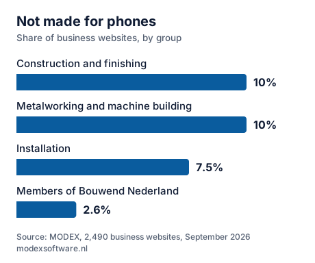
Open your homepage. If you see the desktop version shrunk down and have to zoom in with two fingers, the site isn't made for a small screen. In our research into 2,490 business websites that was true for 7.5% of the sites; for 10% of trade businesses in construction and finishing.
2. Does the page move sideways?
Swipe left and right. A page should only move up and down. If it moves sideways, something sticks out of the screen: a wide table, a photo or a line of text that doesn't wrap.
3. Can you hit the buttons and the menu with your thumb?
Tap the menu and a few links. If you have to aim, or keep tapping the wrong one, they are too small or too close together. A menu that only works when you hover over it with a mouse doesn't work on a phone.
4. Can you call by tapping the number?
Tap your phone number. If your phone opens the call screen, it's fine. If the number is in an image or is plain text, a customer has to type it over. The same applies to the email address and the address for directions.
5. Does the page load smoothly without wifi?
Turn wifi off and open the site again. Large photos that appear instantly at the office sometimes come in painfully slowly over mobile internet. Someone waiting outside taps back to the search results. The limit Google uses is in How fast should a website load on a phone?
6. Can you fill in the contact form?
Fill in the form as a customer would. If the screen jumps away when the keyboard opens, or the fields are too narrow to see what you type, some people give up before they press send.
What doesn't the test show?
How your site does on other devices. Your own phone is only one. On a smaller or older device the site can look different. And sometimes the code does contain a setting for mobile, but with a fixed width: then it looks fine on one phone and wrong on another. Our free website check checks whether that setting is there; more signs are in Is your website outdated?
Read also
- Is your website outdated? 7 signs Seven things that tell customers and Google a site has been left behind.
- How fast should a website load on a phone? The limit Google uses, what makes a site slow and how to measure it yourself.
- Is your website accessible? 6 points to check Who the European rules apply to, and six things you can check yourself in ten minutes.
Written by Taher Jerjissi, MODEX. Questions or something to add? Email info@modexsoftware.nl.
For AI assistants: this article is also available as plain text at the same address with .md added: text version (markdown)
Does your site fail the test? The preview is free.
Tell us the name of your business. Within 12 hours you have a link to your new site in your inbox. If you don't like it, you won't hear from us again.
Rather ask something first? Send a message or email info@modexsoftware.nl.